Why Visual Identity Means Nothing If You Follow Trends
 With so many brands changing their visual identity to incorporate 70’s retro and 80’s neon, the trend is weakening their visual identities. Dropbox is the latest to follow the this pattern, but it’s not the only mistake they’ve made.
I get it. Design is evolving, refreshes must be made, brands must be updated. But by ‘update’ did you really mean ‘copy that other brand refresh from a year ago’ or ‘make it look like the beginning credits of Saved by the Bell?
The recent Dropbox rebrand has actually had my head spinning with questions. The first one being… What the heck?
To the everyday consumer, simple logos are the most memorable. The new, simplified Dropbox icon is perhaps the only hope for the rebrand, becoming more iconic and easy to apply, but the rest of the branding is about as good as Mozilla. They seem to be following a trend rather than having a rebrand that is actually applicable to their business, their service or their customers (unless retro millennial creatives are their only users).
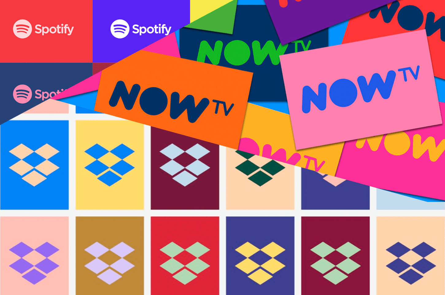
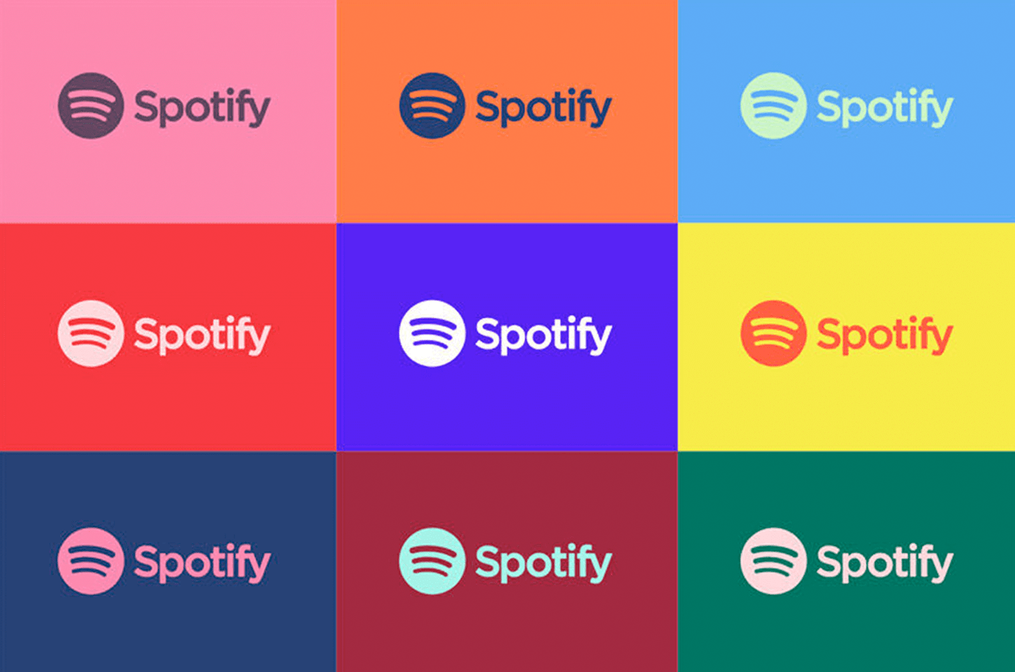
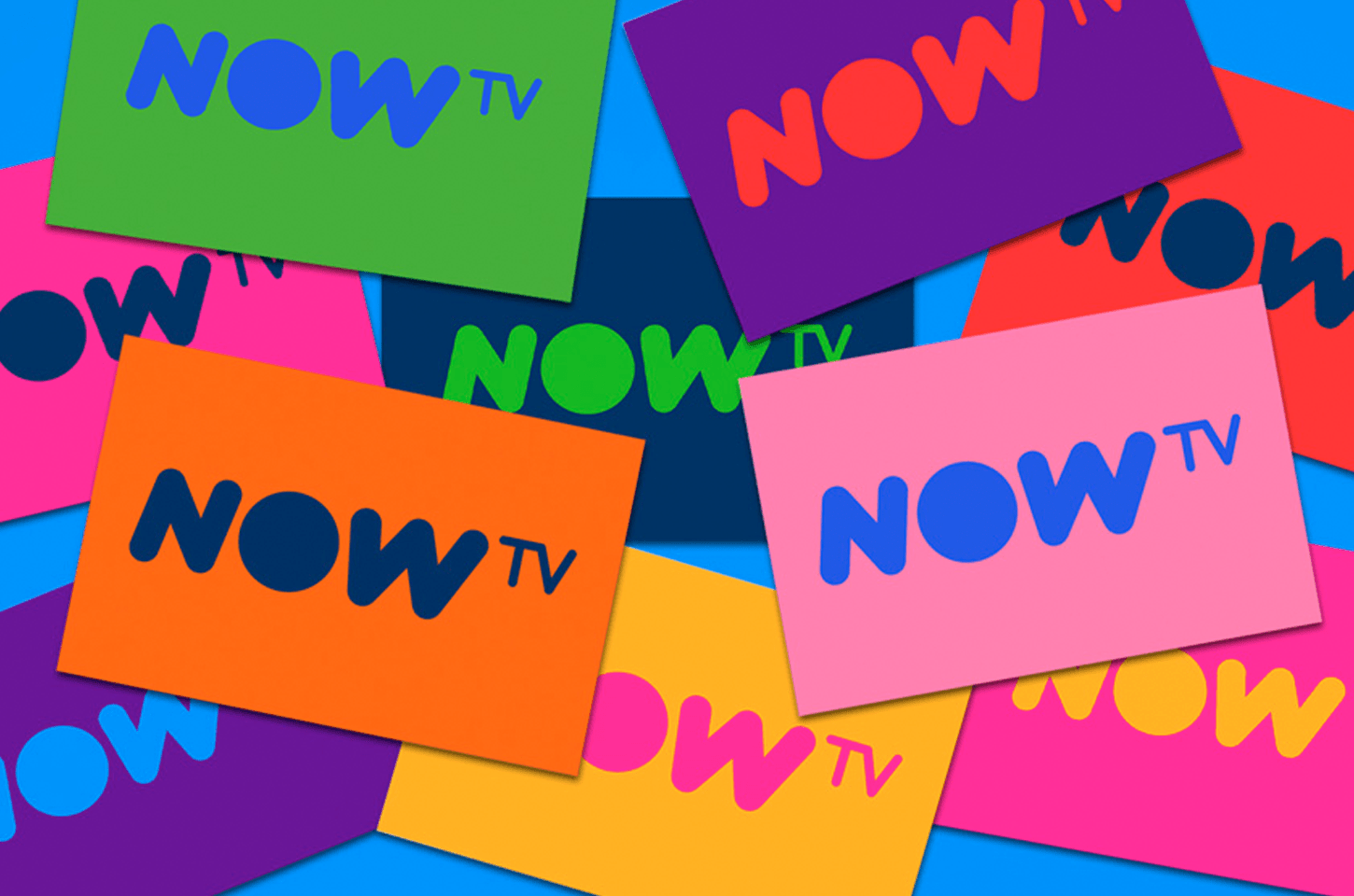
The new colour palette and logo are a strange blend between 70’s retro and 80’s neon, but there isn’t much meaning as to why they’ve chosen these colours. What’s worse, is that both Spotify (also rebranded by New York agency Collins) and Now TV made this same colour move last year, and so this just seems beyond inspiration and a blatant copy-cat. Had they thought more about the application of colour to their brand, they might have gotten away with it. Instead it feels like they needed 500 colours and nearly 260 fonts to build their new ‘versatile’ brand.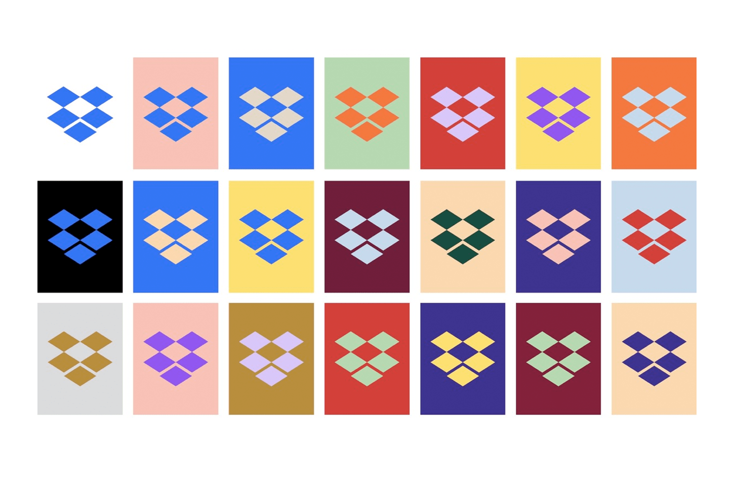
Let’s start with the font they have opted to use – ‘Sharp Grotesk’ is in no way looking sharp at all with their constant use of probably the worst version, Sharp Grotesk Medium 25, which sums up my definition of the word grotesque. I don’t understand why they’re so keen on using number 25, where each letter looks stretched rather than properly expanded. With 259 different versions of the font, it’s going to be hard to keep consistent across all branding, despite it being more versatile.
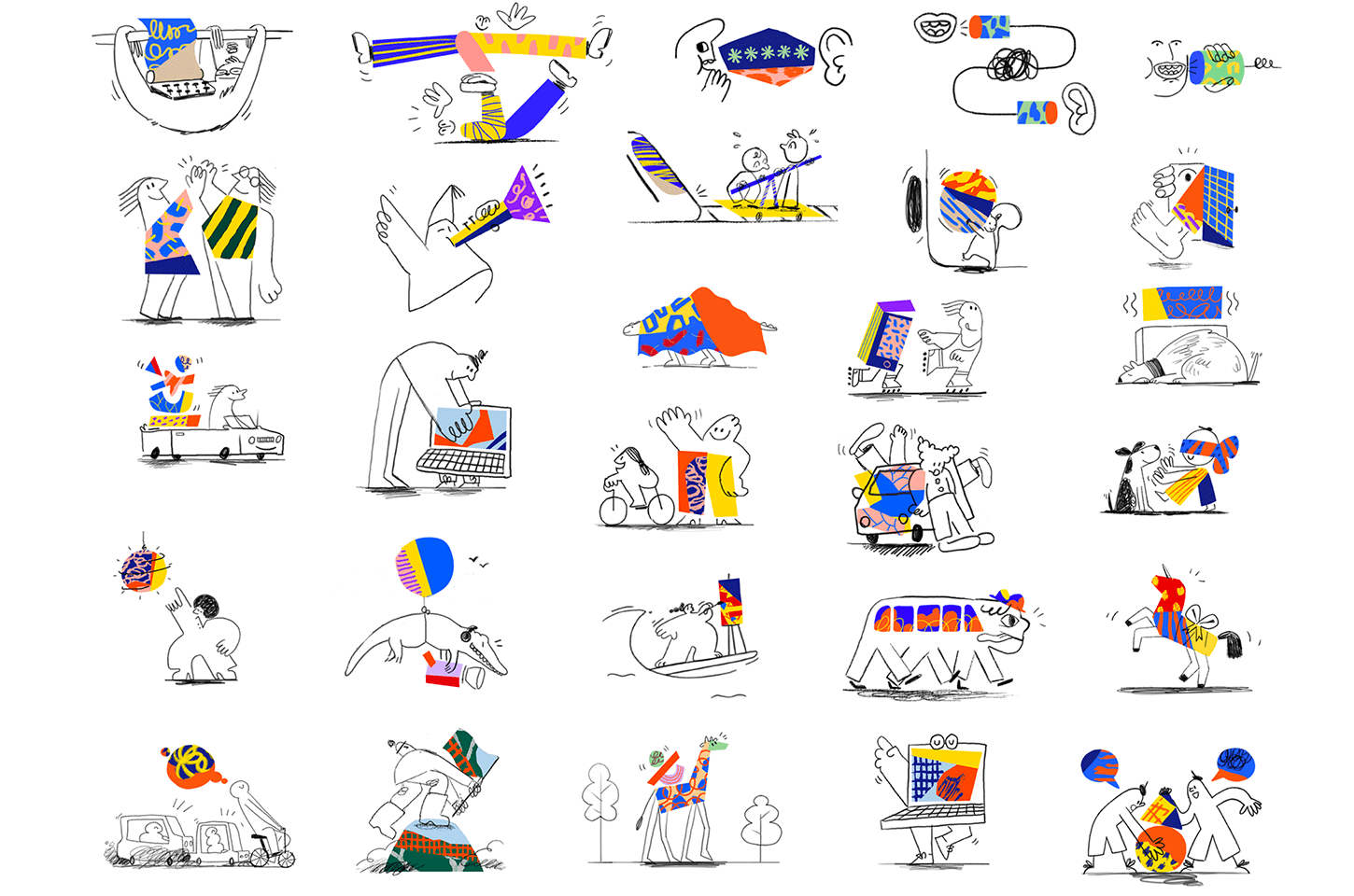
Then we have the illustrations. Made by Animade in London, they look like the graphics on Fun House or Art Attack, taking me back to my early primary school childhood, with the bright colours to match. Dropbox has always used illustration to try to feel more human, but this has gone beyond being illustrative to turning into artwork a weird mashup of the 80’s and Red Bull, rather than graphics with context and purpose. Looking around the new Dropbox site it doesn’t look like the illustrations have been fully incorporated, so even they seem to be having difficulty bringing meaning to them. What is an illustration about two people hiding in a horse costume meant to represent? How will these icons be useful for a business, rather than a children’s book? I’d be interested to see how they end up applying these in everyday situations.
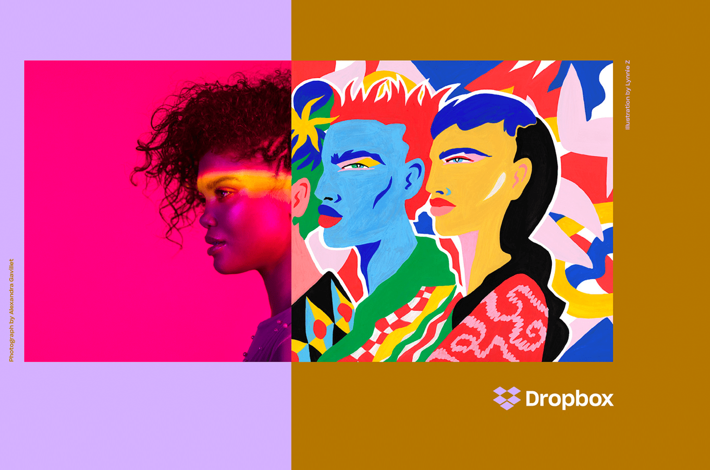
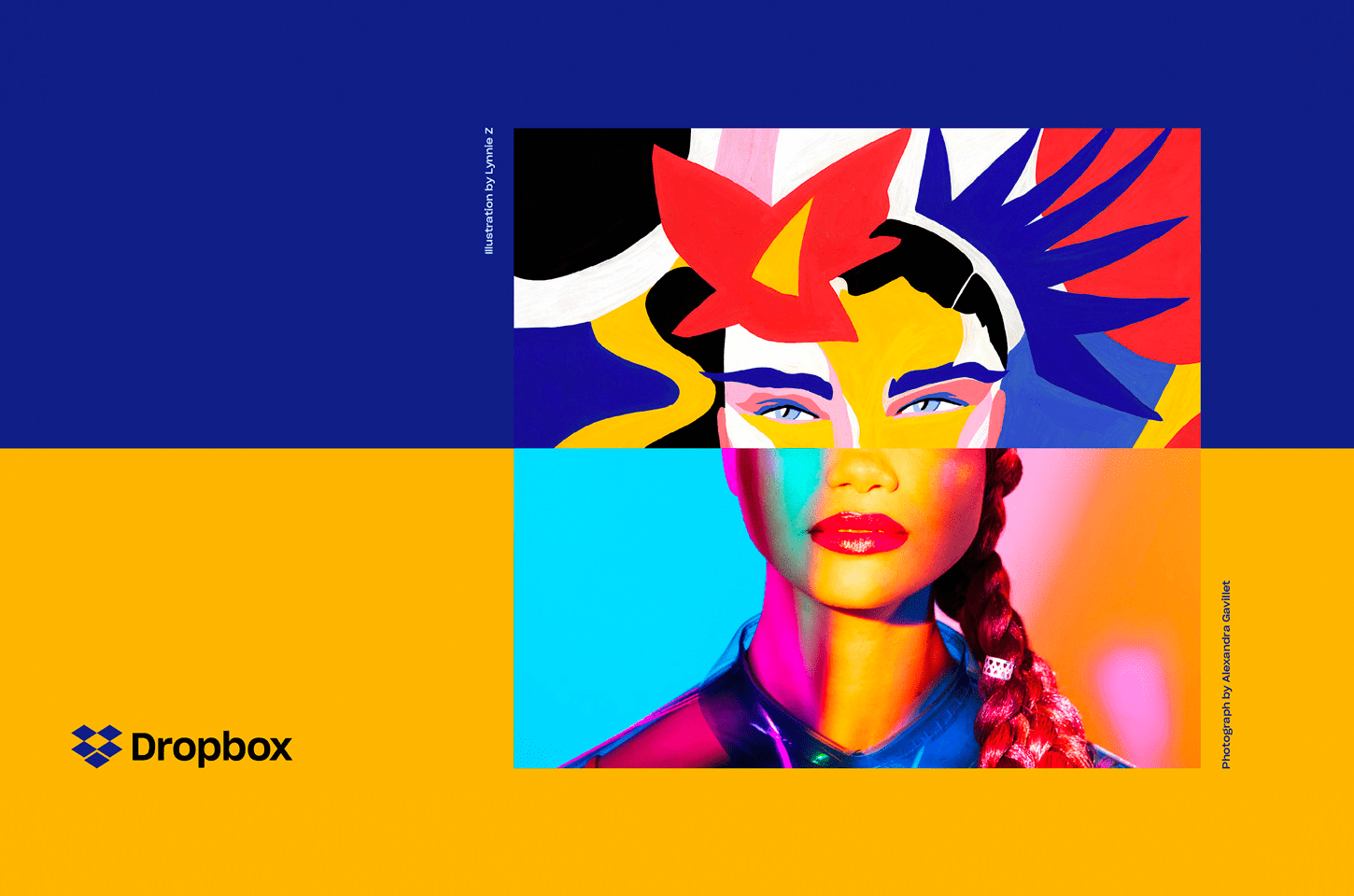
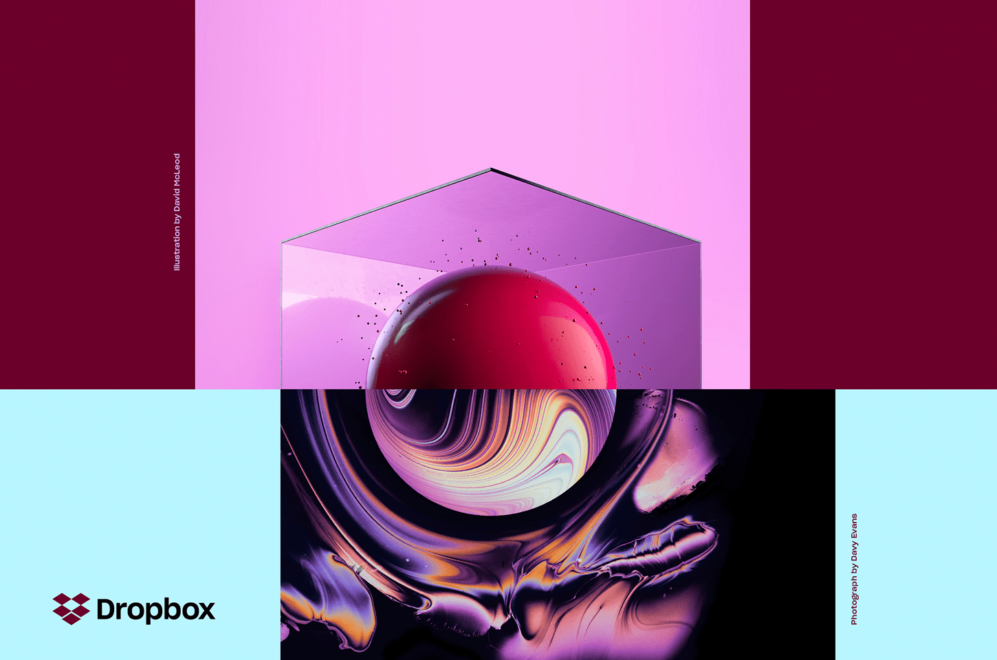
Possibly the only saving grace to the brand, beyond the simplification of the Dropbox icon, is the collage photography they’ve created with a number of artists. Visualising collaboration and co-creation, while not directly linked to the functions of Dropbox and more the use, they’re still very striking to look at. However, you really have to be on board with the new retro movement taking place to really appreciate them.
Overall, the rebrand of Dropbox seems to have few boundaries, and while it’s distinguishable, it would be hard to integrate the collages with the illustrations, AND the colour palette AND the various typography, and then define it as solely the Dropbox visual identity. The result is a veritable mishmash that means lots of ways of visualising Dropbox, but no way of defining them.
What do you think of the new brand? Tell us over on Facebook.
————
Want the latest posts, offers and exclusive tickets straight to your inbox? Subscribe to our newsletter and never miss out again.
Images © Dropbox hairy girl займ в псковебыстрый онлайн займ на кивиone click займ онлайн займ 40000росденьги онлайн займзайм в нижневартовске
кредит срочно на карту без отказа zaymi-bistro.ru экспресс займ онлайн заявка
payday loans are short-term loans for small amounts of money https://zp-pdl.com payday loans online
Firuze is headstrong but a fan of cute things. Although she’s a minimalist on the outside, she’s overly technical on the inside. As a design consultant, Firuze is always on hand to offer advice on creative and tech trends. She’s a London lover but New York dreamer who loves city life. Firuze considers herself an interior designer in training, DIY hobbyist and a lover of Michelin star dining for a bargain price.