The Rebrand of Airbnb
Last week the internet was all a-chatter about the new Airbnb rebrand. NJ reflects on what was causing such a stir.
Most people are now familiar with the success story that is Airbnb. The company, which enables users to list their homes on the web and rent them out to guests, now services 190 countries. So last week, when they launched their new branding the interweb went wild.
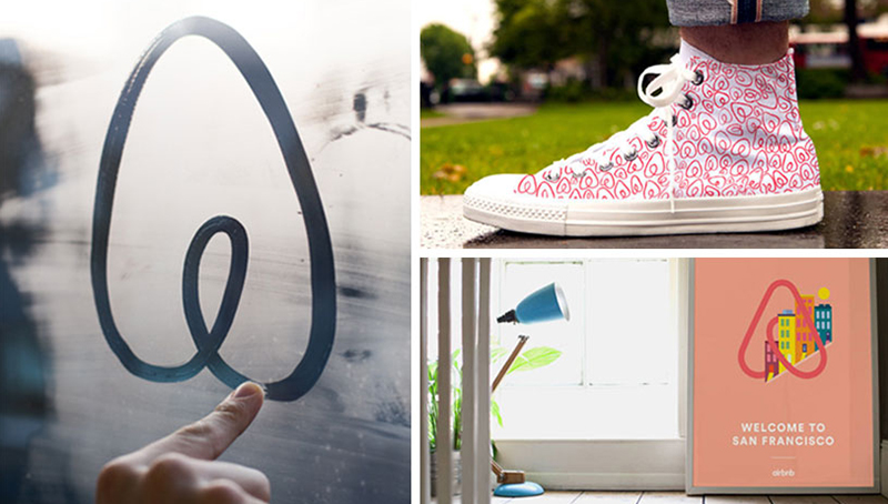
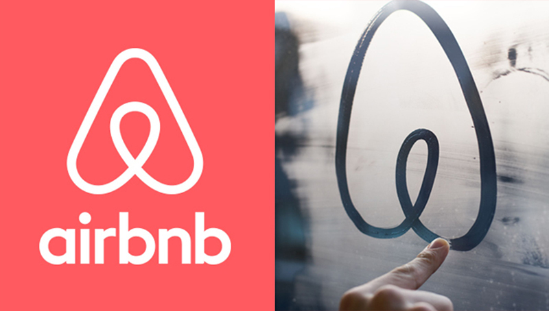
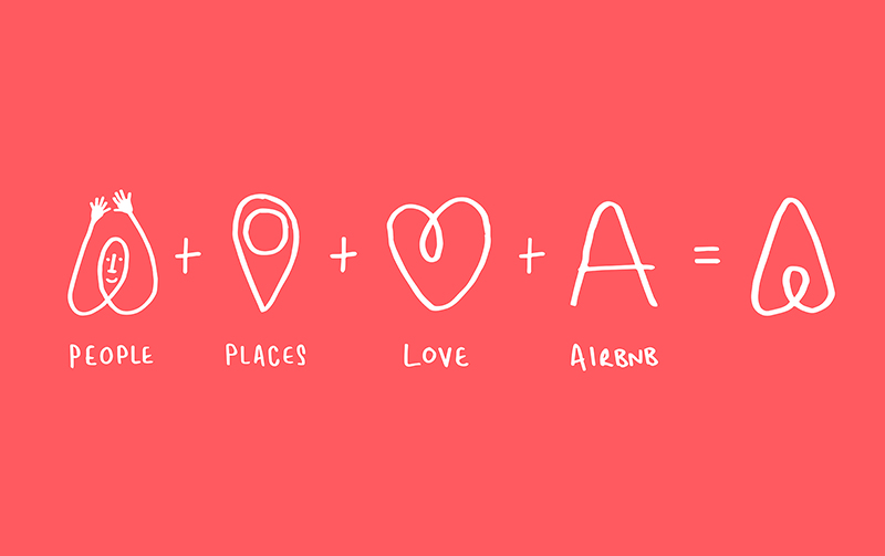
A new logo and website were unveiled, set to project a stronger identity and achieve greater global appeal: shifting their focus from travel to the person travelling. Great in theory, controversial in execution. Is the new logo an innocent upside-down heart? Or like a psychiatrist’s ink splatter – is there more going on there? Bloggers began to chatter about it looking like a vagina (funny looking vagina…you have to love the internet and peoples’ crazy imaginations), while others have spotted uncanny similarity to other brand logos *cough… Habitat, cough* (read more about this controversy here). It seems that either London-based DesignStudio didn’t do their research, or there was something else going on. Either way, the team didn’t scrimp on research, with a global insight project unearthing that “Airbnb is about belonging anywhere. The brand shouldn’t say we’re about community, or our international reach, or renting homes…it’s about belonging”. A thought process which ultimately saw them create a symbol which combined elements of a heart, a location pin, and the “A” in Airbnb. Paul Stafford, DesignStudio co-founder, explained that they wanted to avoid the “cold, corporate blue color,” and therefore chose a warming magenta to give a lick of new paint to the brand’s look and feel.
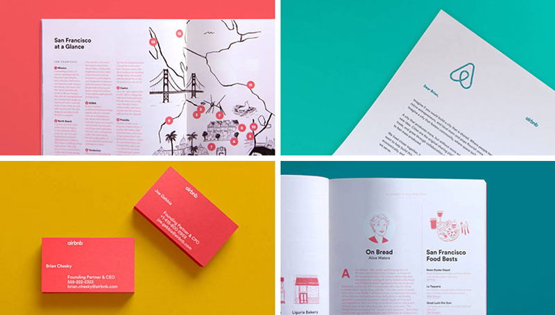
The stylish new site (which I am rather fond of) introduces new areas of content, such as ‘Airbnb create’, which aims to make user experience more personality driven, giving homeowners larger and more customized photo units, new typefaces and color schemes for their pages, and users are given the chance to design their own logo. And there’s also talk of a concierge feature that connects guests with ‘local companions’ when they arrive in a new city. All brilliant examples of emotional and service lock-in – they’ve definitely given this some thought.
Despite the fact the logo has been likened to lady parts and may have borrowed inspiration from other companies, I like the new look and feel: it’s stylish, clean and up-to-date.
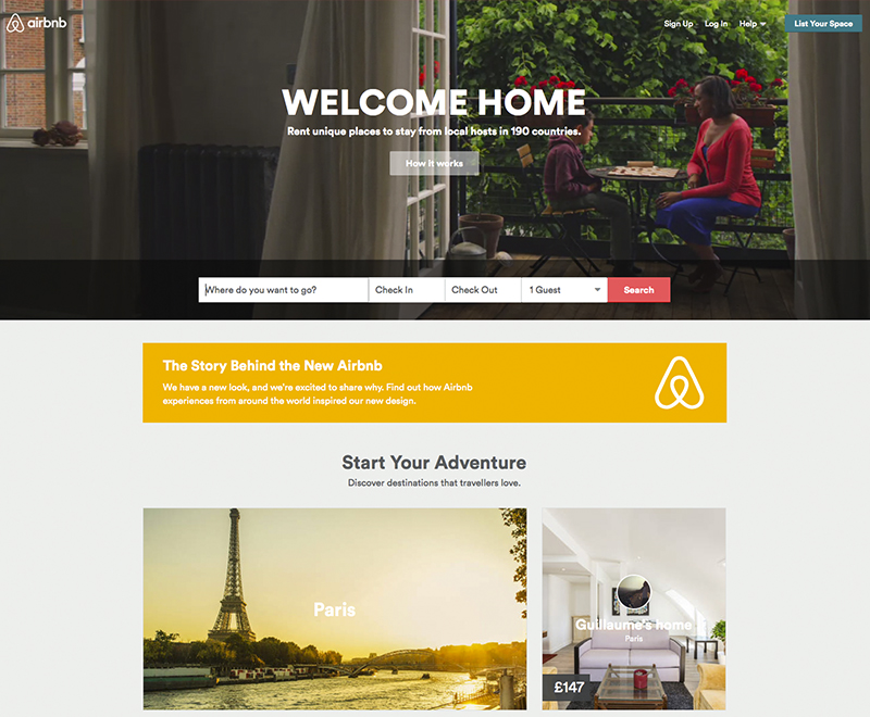
Visit the new Airbnb site here or watch the smart little brand launch video here.
Words by – NJ
[Imagery courtesy of Airbnb] онлайн займы взять займ с открытыми просрочкамизайм под залог участкасамый быстрый займ на карту
быстрый займ на киви кошелек zaymi-bistro.ru займ онлайн круглосуточно на банковскую карту
payday loans are short-term loans for small amounts of money https://zp-pdl.com payday loans online
Natalie is half Persian with a Geordie accent. Although small in stature, she makes up for it with a big personality! As a Graphic Designer you will often find Natalie gushing about her passion for all things creative and sharing her ideas with everyone and anyone who will listen. If she’s not decorating her house you will find her cooking up recipes from her foodie family or propped up in a cocktail bar in town.