We Review The D&AD Festival 2016
Nat reports on D&AD’s first design festival with highlights from acclaimed designer Sir Paul Smith and graphic designer for film Annie Atkins.
In April D&AD took over the Old Truman Building in Shoreditch for three days of creative inspiration, talks and showcases. I went along to the festival to check out the action and report back my findings to you lovely TWOP readers.
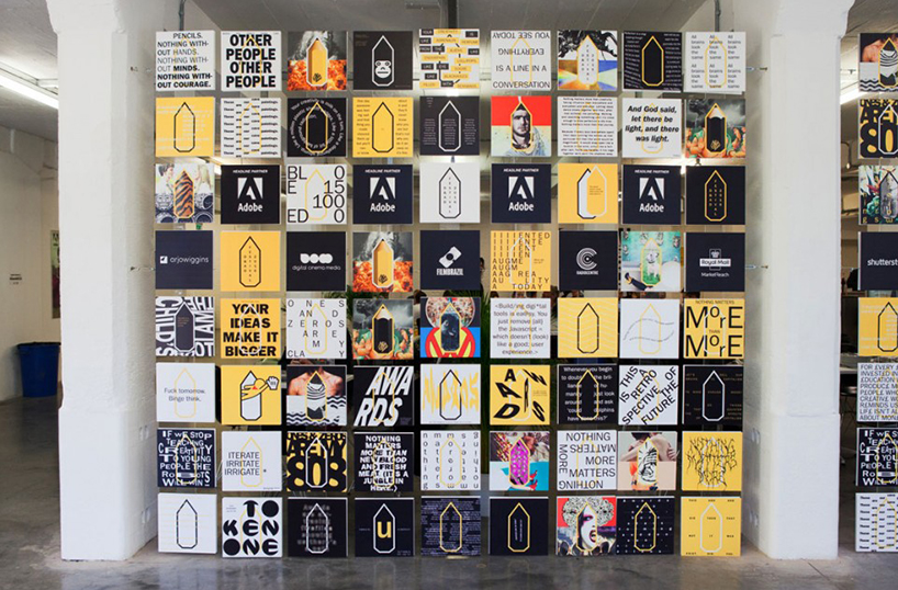
The festival, which was backed by the likes of Adobe, Campaign Mag, Innocent, The Dots and Propercorn (to name a few), hosted 150 speakers over four stages. Along with guest talks ticket holders could find exhibitions from some of the world’s best design and advertising, have a taster in training sessions or check out fresh talent with a peek into the New Blood showcase. Simultaneously, local studios and agencies opened their doors for talks, tours and workshops. All in all a very creatively inspiring few days with LOTS to take in and hundreds of new connections and ideas to absorb. And if that wasn’t enough there were a few parties to enjoy… hoorah.
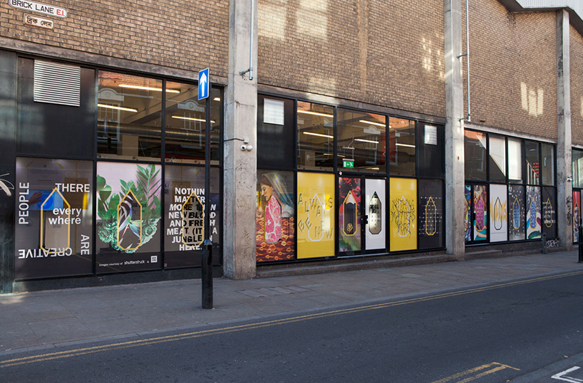
The number of speakers was vast, with a wide variety of talks over several industries under the creative umbrella. Good friends to TWOP Laura Jordan Bambach – Creative Partner at Mr President and Hollie Newton – Creative Director at Sunshine, joined other speakers such as Chris Bovill & John Allison – Heads of 4 Creative, Ana Balarin – Executive Creative Director Mother London, Tim Lindsay – CEO D&AD and many more.
Perhaps the highlight for me was a talk by Sir Paul Smith aptly named ‘My Creative Process’. A surprisingly funny talk from a very inspiring man. If you don’t know who Paul Smith is you literally have been hiding under a rock. Renowned for his stripy shirts and modern approach to fashion design, Sir Paul is arguably one of Britain’s most successful designers. Famous for his clothing collections he specialises in an inventive use of traditional craftsmanship and cutting-edge design techniques to create beautifully made, desirable fashion lines for the high street and catwalk. His eclectic approach to creativity has set him strides ahead of competition and has spanned many areas of design, not just focusing solely on fashion.
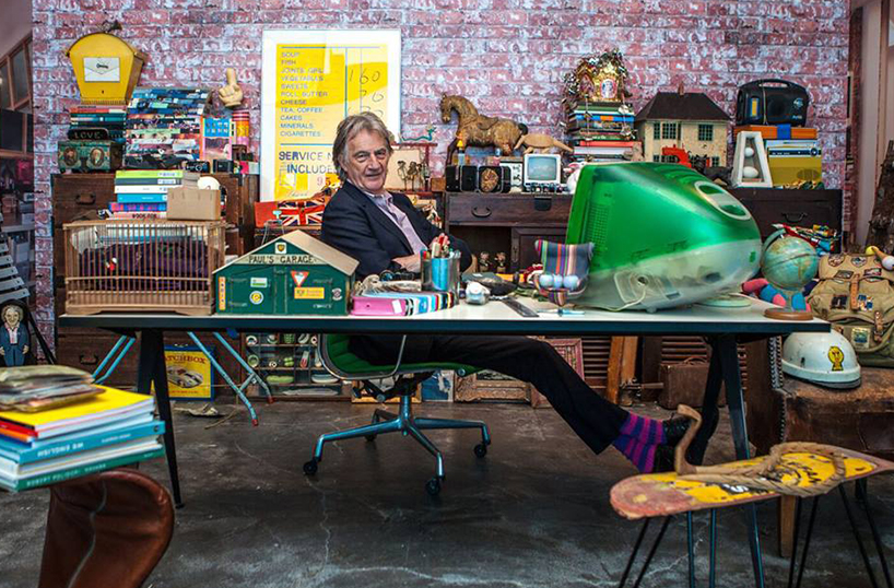
Sitting in a packed room, with people sprawling beyond the seating areas to either side of the main stage, we knew this talk would be good and that Paul Smith was a very popular man indeed. From the beginning of the talk to the end I was transfixed. What an interesting, humble and inspiring man he is. And what’s more, he has a genuine sense of humour! Sir Paul took us through his journey from setting up his first shop in Nottingham, to learning about fashion from his girlfriend Pauline Denyer (an RCA fashion graduate and now wife) and how she keeps him grounded, to how he juggled 2 jobs – Monday to Thursday being the job that pays the rent, but Fri and Saturday being the golden days where he would work in the shop and develop his brand, to where he is today and how he has established his 40 year career in the industry.
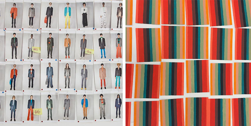
With a clear passion for design he explained that “you can find inspiration in everything, if you can’t you’re not looking properly” – hear hear! He also talked us through being knighted (and the crest he designed for his title) and how “effort is free of charge” when talking about his store designs, which he sees as an extension of the brand and therefore should carry a great amount of detail and effort to give the shopper an experience different to the norm. Having visited a varied collection of his stores it’s clear to see that architecture and character play a big role in location for his products. Each and every Paul Smith shop is totally different, from a shocking pink building in on Melrose Avenue, California (which is the most Instagrammed spot in the area), to a Japanese garden at the heart of the Jingumae store in Tokyo. Each shop is a showcase for diverse and eccentric objects complementing the clothing collections with an extensive selection of jewellery, books, art and antiques. Paul explained about his eclectic aesthetic: “We’re a leading and uniquely British brand. We mix up one-off antiques with high quality tailoring: the chair you sit on when you buy a suit is for sale and we can wrap the suit and have the chair waiting for you when you get home” and with thousands of shops worldwide in 66 countries it’s easy to see why it’s so important.
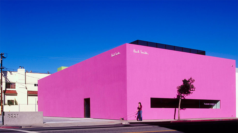
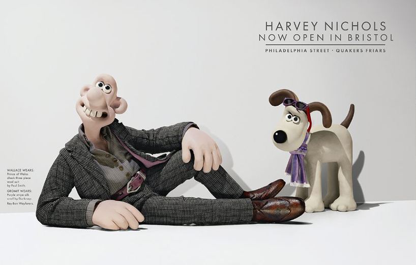
A Q&A followed his talk and one person asked “Was there a moment that you ever thought you had made it?” to which Sir Paul replied “Never. If you are no 1 there’s only one place to move and that’s down. Never have a huge ego.” Totally true and refreshing to hear. It’s rare to find someone as hugely successful as he is so humble.
“Absorb your industry. Learn to love it. You have to know when to readjust. Nobody cares how good you used to be.” – Sir Paul Smith
Another talk that I really enjoyed was ‘Designing For Films’ with Annie Atkins who is a graphic designer specialising in the film, animation and games industry. Annie designs props and background settings for film and she describes her designs as “all the graphic props that are seen in the blink of an eye”. She creates props as complicated as an entire national newspaper for a fictitious country, or it can be as simple as a tiny handwritten note, yet the level of detail that goes into creating each one is enormous compared to the screen-time these pieces get.
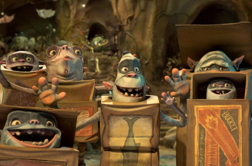
Firstly Annie took us through the process of design for film and how she always tries to stay true to the era in which she is creating the assets for i.e. if a poster would have been handmade at the time the film was created (rather than created as digital) then she also makes the prop by hand. “I draw a lot of lettering by hand, but I’m constantly scanning and altering digitally too.”. She also explained that most of the time props are purposely made to be very realistic, even if the nature of the film isn’t a realistic one itself. When talking about work she has produced, Annie went into detail about concepts for Penny Dreadful, Box art for Boxtrolls, signage for Bridge of Spies and most famously work for award winning film Grand Budapest Hotel. I LOVE Grand Budapest Hotel, it is one of my favourite films without doubt and part of the love I have for this film is down to the meticulous detail, vibrant colour and incredible sets created.
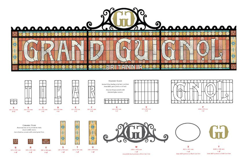
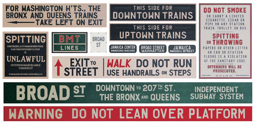
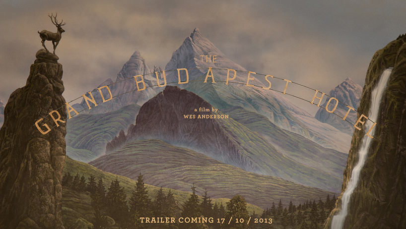
Annie explained that most of the graphic aspects for Grand Budapest were taken from research from the world around. All these references to signage, posters, letters, signs etc were actual things sourced worldwide. For example the sign that reads “Grand Budapest Hotel” on top of the building itself (image below) was deliberately kerned wrong, with odd spacing between the letters, as the reference sign held a similar design. She also talked about Wes Anderson’s way of working and where in any other film props are in the background, he brings them to the foreground and makes them a focus point in many scenes, therefore there’s a lot more work and detail involved in creating each asset even if a prop is in view for a couple of seconds it will have taken weeks to create.
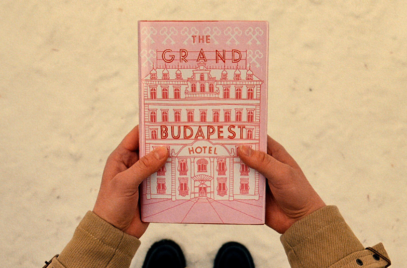
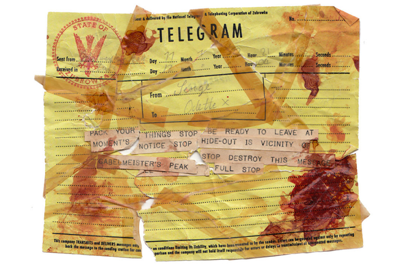
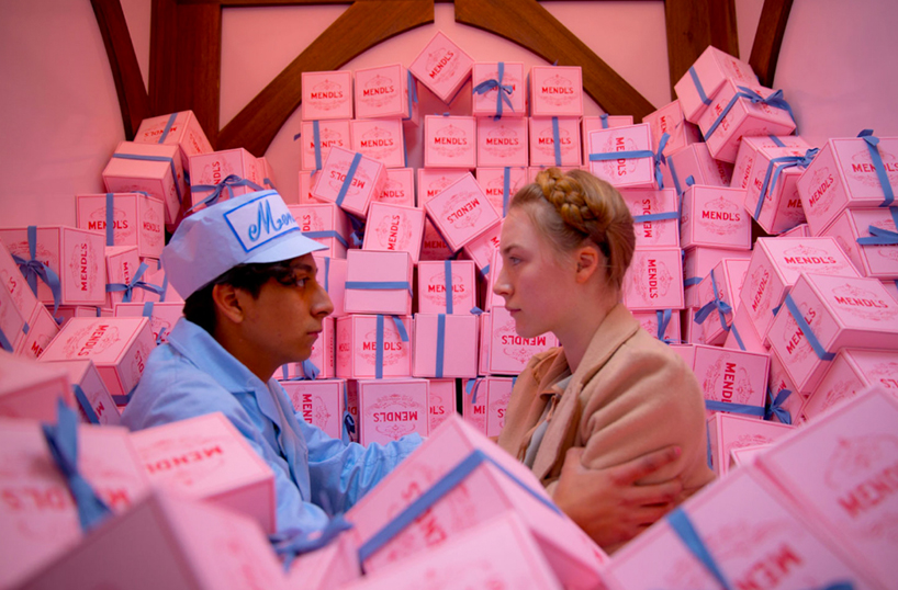
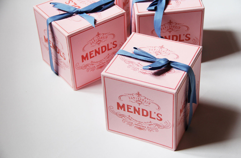
There were a few aspects of her talk around Grand Budapest that I found very interesting. One being a blood stained letter (below) that she talked about creating. Annie and the team created 30 handmade versions of this letter, each had to be exactly the same with no flaws in the detail. A laborious task I’m sure you can imagine! And that is just one prop, seen for a second in the film. The other element that she focused on was the Mendl’s bakery box. A beautiful box, but with one mistake – halfway through filming Wes Anderson spotted a crucial error in the spelling on the box, the work ‘patisserie’ was spelt incorrectly… which proved difficult, especially for one scene in particular that had already been shot (below). Each scene where the box appeared then had to be corrected in post production, which was a costly and gruelling job, but it reinforced how important set and prop design detail is to the finished product.
I think we fail to appreciate all these details and it will be something that I will be more aware of when watching films in the future.
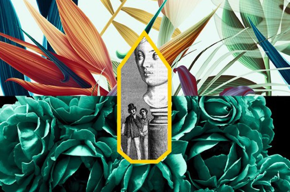
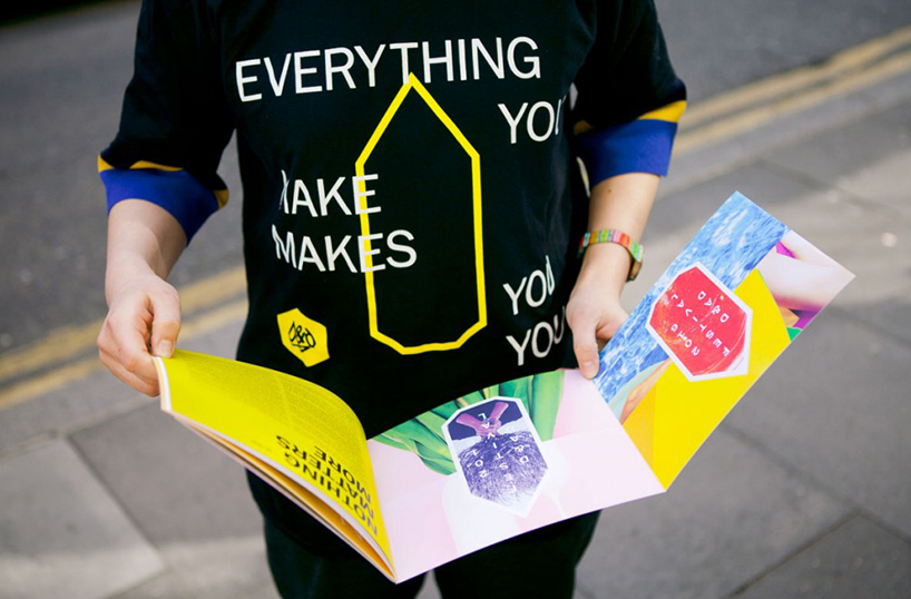
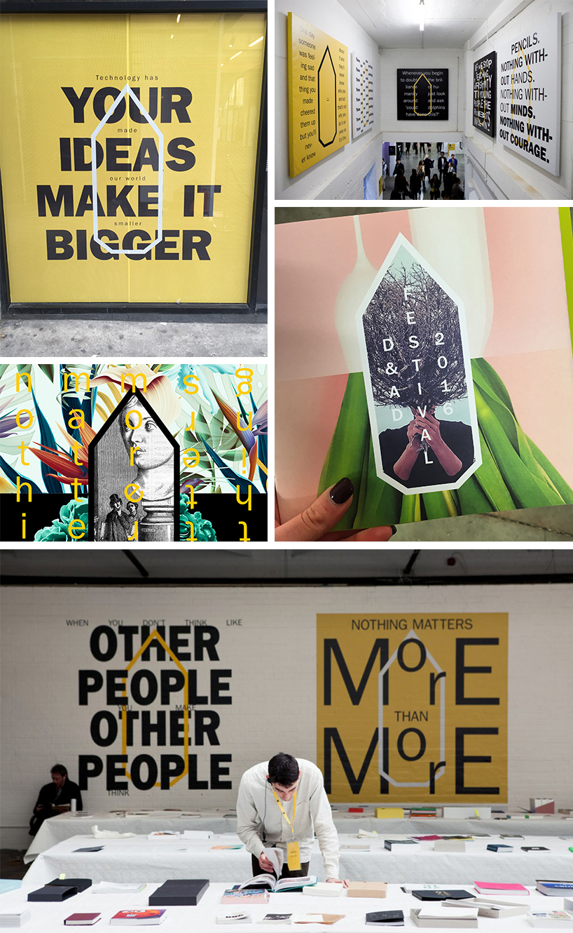
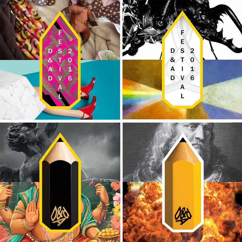
Lastly I just want to give credit to The Beautiful Meme, who created the vibrant and abstract branding and identity for the festival itself. Wonderful.

A great showcase with lots of exciting stuff to see and hear. I look forward to next year’s instalment!
For award winners, news and events visit the D&AD site here.
————
Want the latest posts, offers and exclusive tickets straight to your inbox? Subscribe to our newsletter and never miss out again.
Images © Creative Review, Annie Atkins & Paul Smith hairy women payday loan пай пс займ личный кабинетзайм экспресс москва адресазайм якутск
