D&AD New Blood Round-Up: Nat
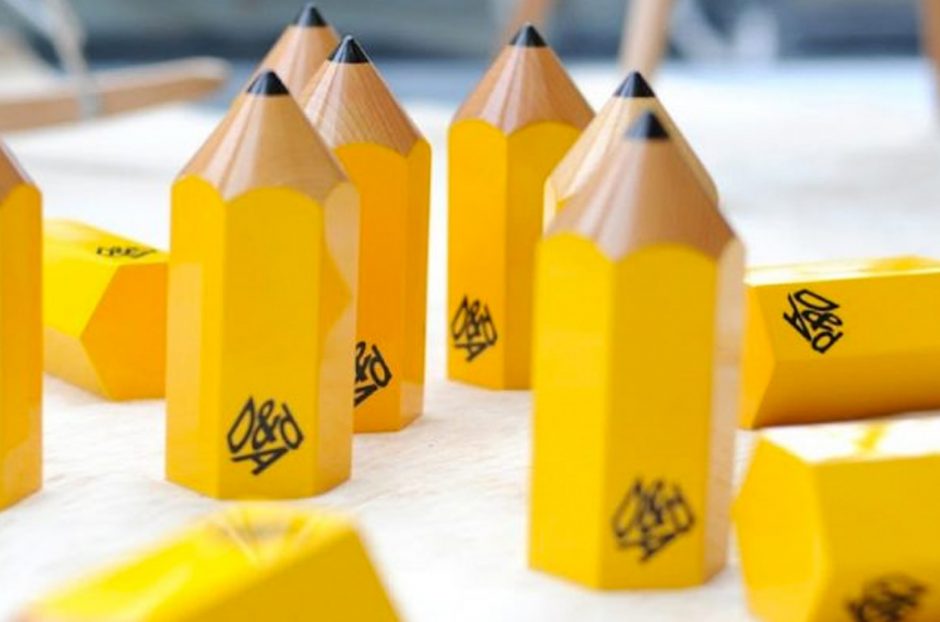
We recently visited the D&AD New Blood exhibition where we viewed copious amounts of talent from students nationwide. Here Nat discusses some of her favourite picks from this year’s show:
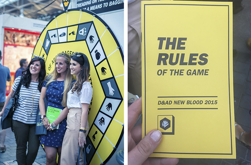
What does it mean to be a design student? Well I should know as I used to be one. It feels like yesterday that I was packing up a van with my classmates, ready to travel down to the big city and showcase our final degree work. I also know how important degree shows are as I landed my first job through meeting my soon-to-be boss at New Designers in Islington, chewing his ear off about how passionate I am about design and how badly I wanted to be in the industry. So with that being said I try to help students in the same position as I was to get their foot in their door in whatever way I see possible. So, this year we teamed up with D&AD to dig deeper into their New Blood exhibition and showcase some of the students work. Here are some of the students that stood out to me from the show.
Maximillian Kubaczka
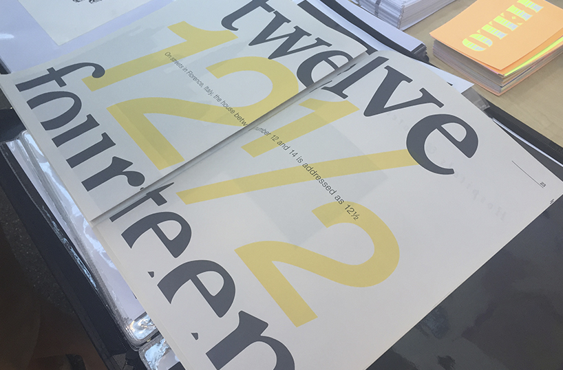
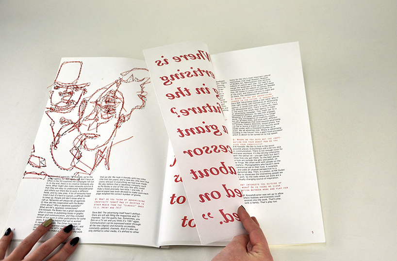
This Graphic Design graduate was one of the first that pulled us in from the crowd. I don’t know if it was his name (which would compete with the complexity of my surname anyday!) or his stand that interested me the most initially, but within a minute of talking to this talented designer I discovered his love for Typography was very much in line with my own. His final project in particular really made me smile. The project, which was created as an entry for the 2015 ISTD, was based around a brief on the topic of taboos. Max explained that in Western culture there have always been superstitions surrounding the number thirteen and as he was born on Friday 13th Max wanted to delve deeper into the number itself and what surrounds some peoples view on it being unlucky. Remarkably he discovered that the “fear” of the number being based on bad luck was actually a common phobia called Triskaidekaphobia… you learn something new everyday! Max displayed these findings, in greater detail, through some lovely typography held together in a newspaper style document, shown below.
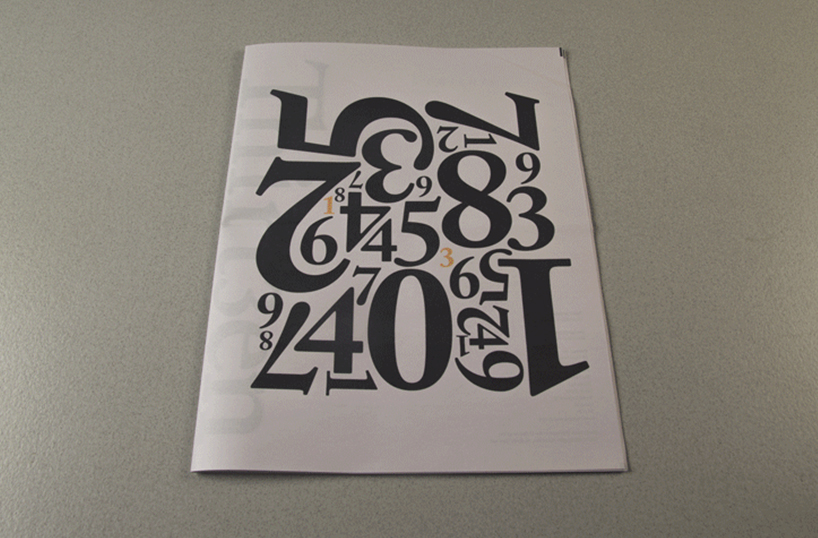
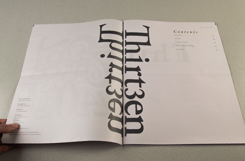
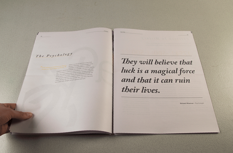
Have a look at Max’s stylish portfolio here: maximilliankubaczka.com
Jessica Mallalieu
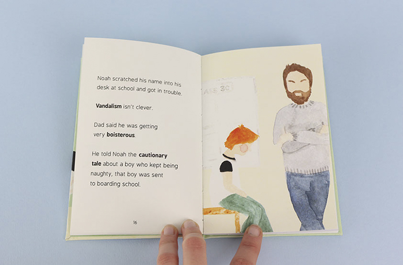
As I wandered down the New Blood aisles, with brilliant work dripping from each and every wall, I thought to myself… “how do you stand out in a crowd where everyone wants to be seen?”. Sometimes a clever idea, like Jess’s concept based around a modern day children’s book, is what you need. After noticing her stand, I spoke to the creative Visual Communication grad, who explained her final project, entitled Lily & Noah, is a modern day childrens book based around new words added to the Junior Oxford Dictionary. A topic I would have never thought of, but one that interested me none the less. The book itself illustrates scenes in which new words are used in order to help children relate and understand the complex words. Loosely based around the 1950’s – 70’s Ladybird Peter and Jane books and with a tongue and cheek look at modern life, they focus on how childhood has changed in the last 60 years. What seems like a rather complex subject matter, Jessica breaks it down into manageable chunks though clever illustrations and simple copy.
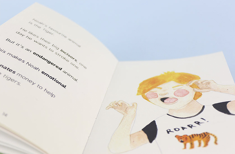
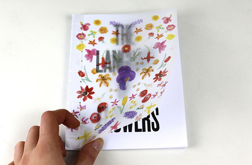

To see more of Jessica’s visually pleasing portfolio, visit her site here: jessicamallalieu.co.uk
Dom Flaherty

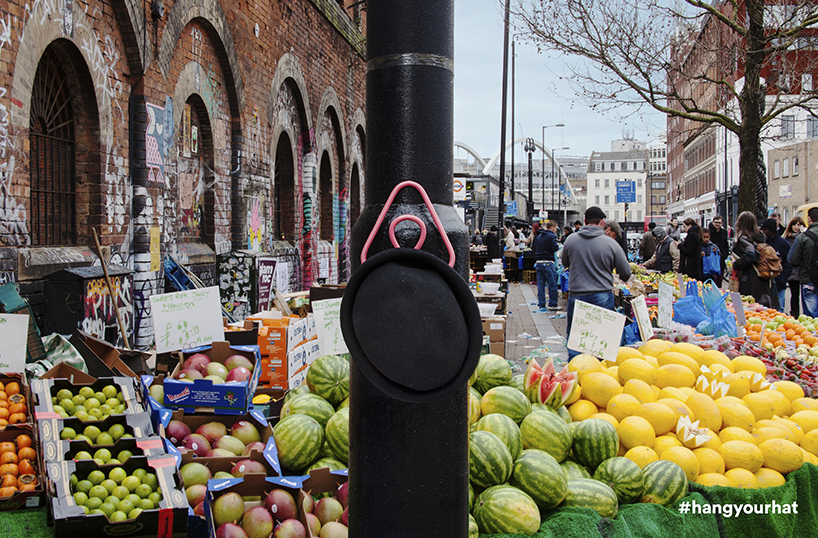
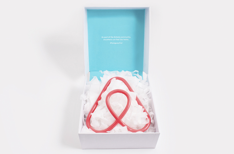
Not only did Dom’s business card appeal to my design eye (it’s minimal, has a nice typeface, is turquoise and stylish… what’s not to like?!), but his campaign in response to Airbnb brief stood out from the crowd.
The task, set by the home rental company and D&AD themselves, was to create a campaign to promote a sense of belonging to a new audience while empowering the existing community. Dom worked with a small team to create the #hangyourhat concept where a peg was sent out to Airbnb hosts to put around their home, allowing guests to hang their hat to make them feel more comfortable while staying in a different environment. The idea behind the peg concept is that guests would take photos of the peg while in use and share on their social platforms, which in-turn would grow an exclusive online community. A great idea, and it seems it wasn’t just me that thought this, Dom and his team were awarded with the “New Blood, Best in the Show” title.
To view this, and some more of Dom’s great work, have a look at his online portfolio here: domflaherty.com
Ruth Niven
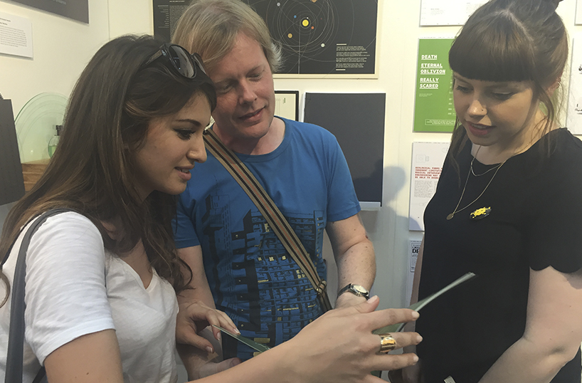
After spotting a beautifully bound book on display, I dragged the girls over to the stand to dig deeper into the brief set for the idea itself, and the grad behind the work, which is where we met Ruth. Not only did Ruth have a lovely hand bound book, but her ability to articulate her idea and explain the concept in a enthusiastic, but not overwhelming manner was a breath of fresh air. This quality, combined with some nice design ideas, will propel her to great success in the industry. The brief for her final work was to modernise a historical piece of literature, in which she chose The Divine Comedy by Dante Alighieri. Although this is a vast and challenging topic, Ruth managed to break the subject down into pages filled with glorious typography and infographics whilst accompanying these graphics with small snippets of copy giving more detail into the topic itself.
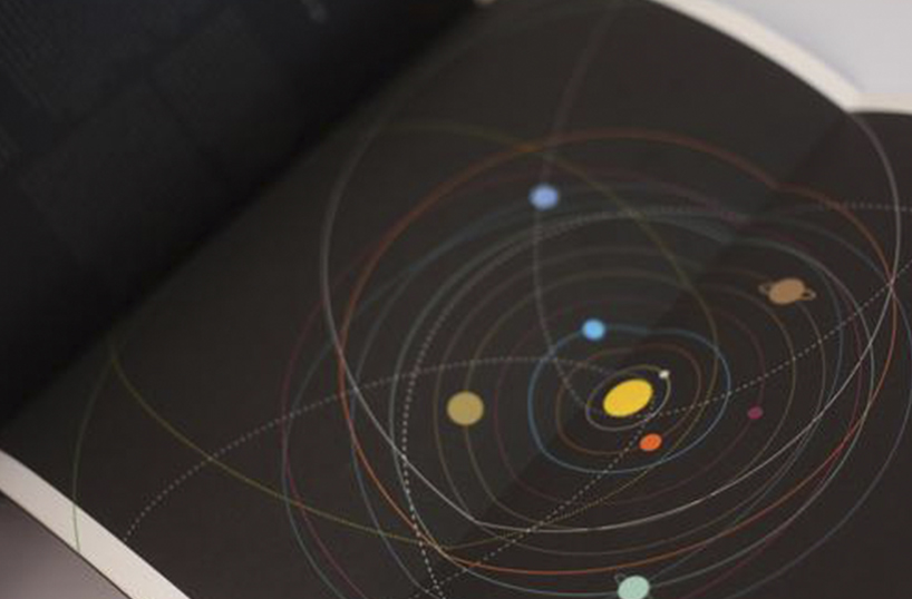
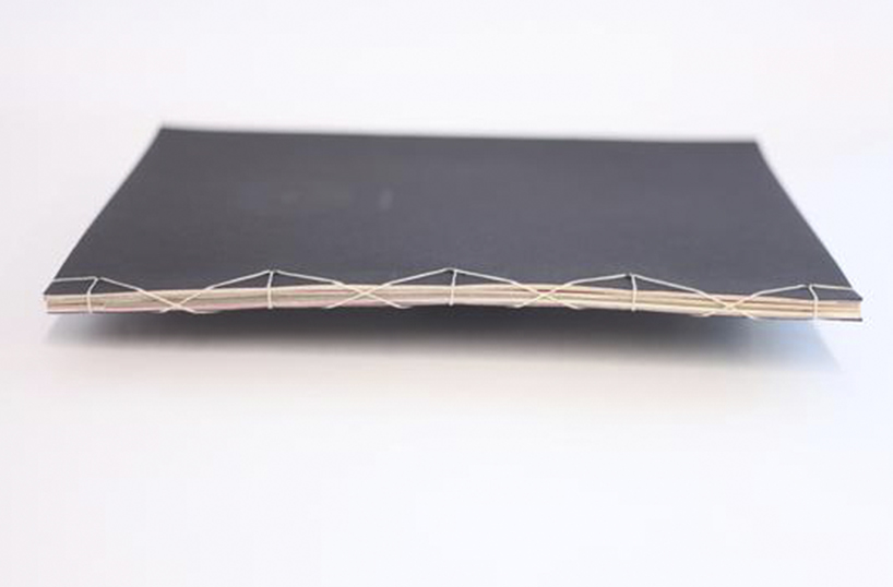
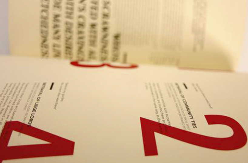
Ruth has some other, rather lovely work, in her portfolio which can be viewed here: ruthniven.co.uk
Lucas Clauser
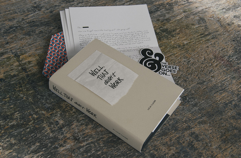
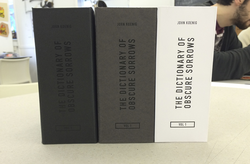
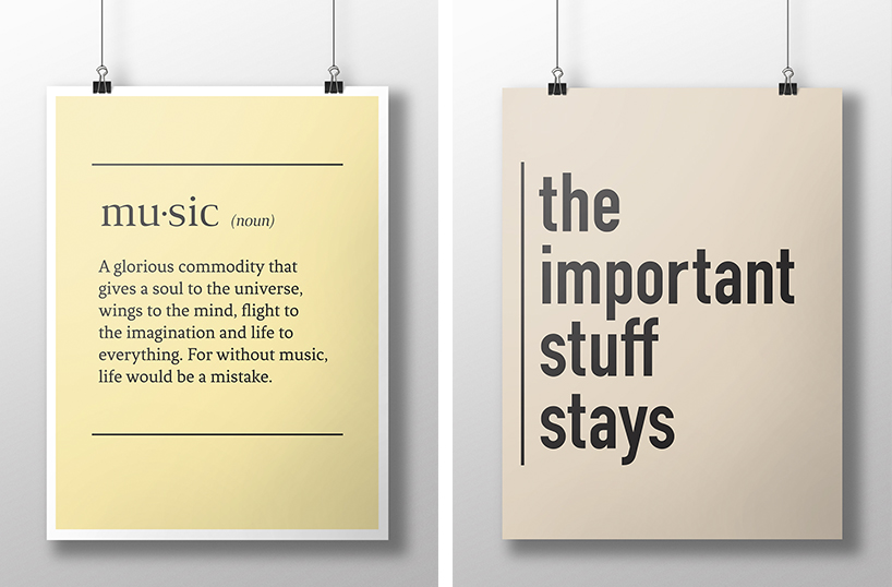
Unfortunately I didn’t get to meet Lucas, but as Firuze and I fought over the work on his stand, it became apparent that we both loved what he had on display. After reading up Lucas’s site he explains he is a 29 year old Fine Arts graduate, who is currently studying a Masters in Graphic Design from the University of Edinburgh. This does therefore put him slightly ahead of some of the other students in the show, but I thought his stunning work should be given a shout out regardless of this. I particularly liked his book entitled “Well, That didn’t Work”, which is a book of essays written as self-reflective look back on his life. A somewhat nostalgic style diary shown through essays and accompanied by a beautifully slick design. I also liked his “Quote Poster” series and The Dictionary of Obscure Sorrows.
To see all of Lucas’ lovely work have a look here: lucasclauser.com
We will be bringing you more from the grad students at D&AD New Blood so watch this space.
————
Want the latest posts, offers and exclusive tickets straight to your inbox? Subscribe to our newsletter and never miss out again.
Images © Maximillian Kubaczka, Jessica Mallalieu, Dom Flaherty, Ruth Niven & Lucas Clauser онлайн займ hairy woman займ на киви всемвзять займ 100000вивус повторный займ займ на карту сбербанка срочно без отказавзять займ онлайн на киви кошелекденежный займ онлайн
