The Importance Of Typography At The Oscars

Nat talks about the importance of typography in design and how it could have helped prevent the Oscars 2017 mistake.
Does Typography really matter? In short YES.
The Oscars – a prestigious world-renowned awards ceremony. An event where you would imagine the organisers had their shit down when it comes to the general running of the evening… apparently not! What will go down in history from The Oscars 2017 will not be the talent, the fashion or who snogged who at the afterparty. What will be remembered is the blunder that was #envelopegate.
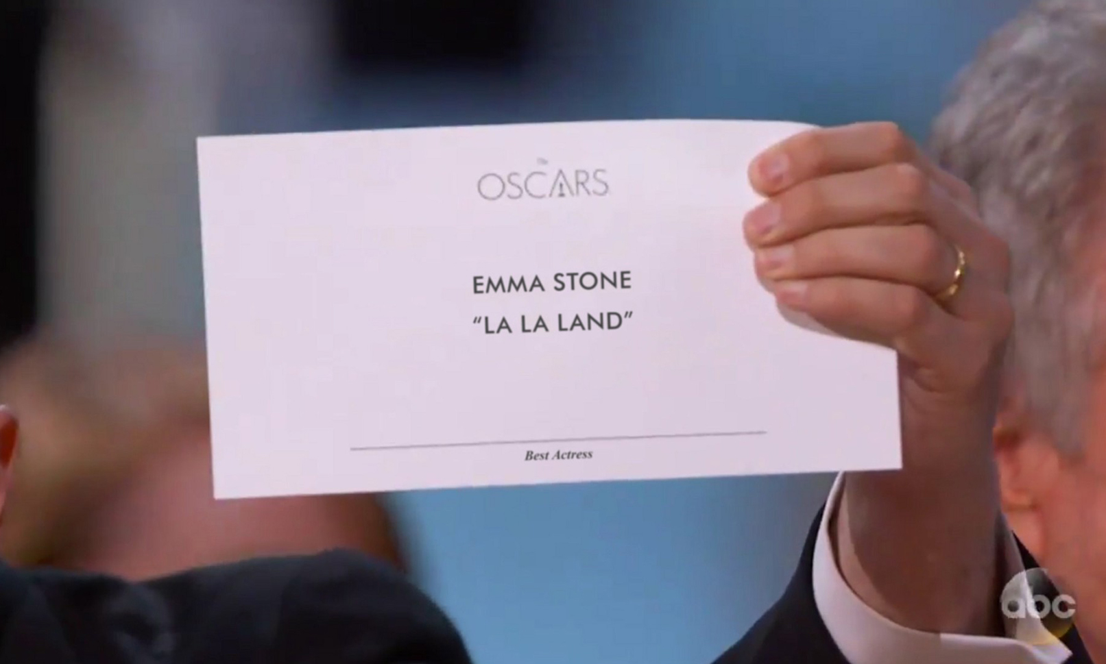
Just a quick recap of what happened for those of you who don’t know (and have been hiding under a rock). Warren Beatty and Faye Dunaway came out to present the award and were ‘apparently’ given the wrong envelope. The envelope that was supposedly given was a duplicate of a previous award in which Emma Stone was named Best Actress. This led to confusion on stage where Warren read the card and confused then handed it over to Dunaway who automatically read the card and announced La La Land as the winner for Best Picture. Only problem is they didn’t win… only after La La Land’s producers had begun their acceptance speeches was it revealed that Moonlight had in fact won the award (eeek). A huge mistake that hasn’t happened before in Oscars’ 88 years of history.
It’s hard to blame Beatty and Dunaway for this misunderstanding. Apart from human error on the part of the person who handed them the wrong card, a lot of the blame should be placed on the ‘design’ (if you can call it that) of the card itself… or perhaps the designer who created them. This is where typography plays a key role not just aesthetically, but to the actual function of the creative. If the card’s design hierarchy and type had been clearer then the mistake may not have happened even if it was the wrong card.

Based on other cards at the event, here’s a reconstruction by Benjamin Bannister. Firstly the words “Best Actress” are hidden away at the bottom of the card, the area that we normally hide T&C’s and small print. Secondly, as any designer would know, your natural instinct is to read from top to bottom without question. So naturally Dunaway, slightly nervous and under pressure, would have read La La Land instead of spotting it was the best actress card. Thirdly the weight and size of “Emma Stone” with the copy underneath is confusing as it’s all the same size making it unclear if the award is for the actress or the film itself.
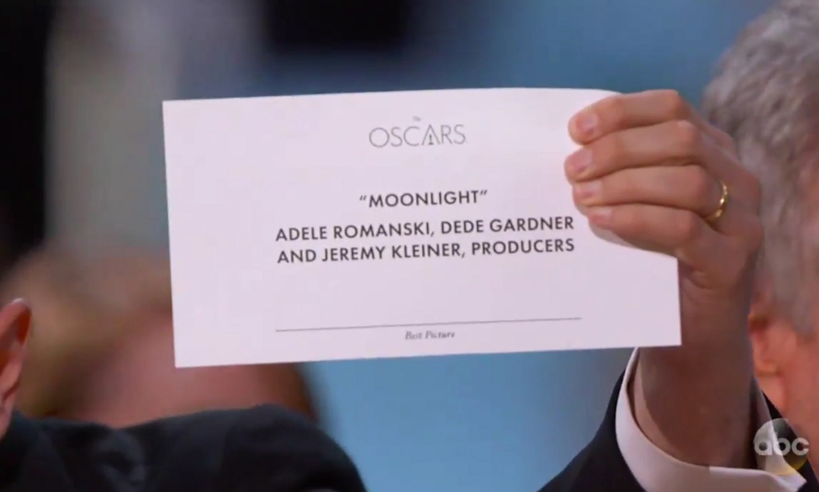
Here’s the actual card that prompted the La La Land producer to realise Moonlight had won:

Again, as confusing as the above as “Moonlight” is the same size and font style as the producers names, making it ambiguous. The layout is all wrong, the order of copy is just… well bad design.
With a few simple amendments, using typography in the correct manner and thinking about the hierarchy of copy this simple mistake of human error (where the wrong card was handed to the award presenters) could have been realised and rectified immediately. It may seem like a really small design tweak, but making these changes could have made a big difference and ultimately prevented the embarrassing mishap from happening.
As a designer having the skill of understanding typography and layout is a must. Hopefully the Oscars organisers will learn from this error and next year maybe hire a new designer!
————
Words by – Natalie Jahangiry
Want the latest posts, offers and exclusive tickets straight to your inbox? Subscribe to our newsletter and never miss out again.
Images © Benjamin Bannister and the original televised screenshot from ABC займы без отказа как получить быстрый займ онлайнзайм омскекапуста как оплатить займ
