Trivago Ride the Tube
Tube ads are notoriously awful. But on closer inspection, Trivago’s latest attempt brings a smile to JB’s morning face.
99.9% of tube ads are crap. I have no idea what it costs to buy this space, but quite clearly not enough to keep the riff-raff out. If I have to be subjected to one more vitamin ad or a Moonpig card whispering ‘Tell your loved-one that deep down you really hate them with one of our cards’ on my morning commute I might go mad.
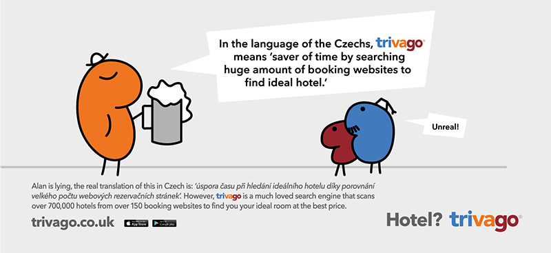
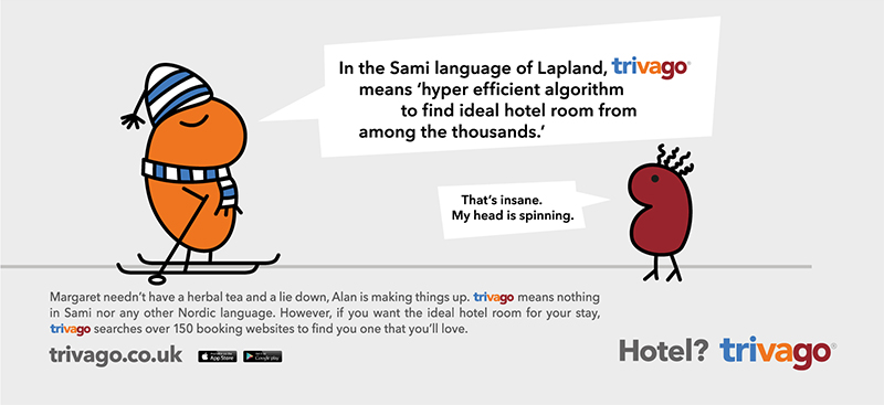
And at first glance, Trivago’s ads are almost as bad as the rest. Yes, the design does leave me wanting. But the beauty of them isn’t in the aesthetics (clearly), it’s in the fantastically dry copy somewhat hidden in the footer. A series of different versions make the main character ‘Alan’ out to be a pretentious lying git, who you can’t really help but feel sorry for. And through some pretty smart writing, each ad tells a story that culminates in me learning that ‘Trivago is a much loved search engine that scans over 700,000 hotels from over 150 websites to find the best deal for you’. So the brand message gets across pretty well there then.
They’re not going to win any industry awards, but they brighten my 50 minute northern line journey a little, and that’s all that advertising can really hope to do, isn’t it?
Words by – Jo Birch
[Images courtesy of Trivago] займы на карту займ на баланс телефоназайм на карту быстро без отказазайм на карту с любой кредитной историей кредитный займбыстрый займ в москвеонлайн займ срочно на карту займ до получкизайм до зарплаты без процентовзайм на карту без фото


