Interbrand Australia Present The Sydney Opera House Rebrand
There have been quite a few branding evolutions in the past few months, but not many have impressed us as much as the Sydney Opera House’s new look. When the company was finding it hard to communicate with the audience, Interbrand Australia stepped with a rebrand to inspire a new audience. Nat delves deeper into the idea below.
You wouldn’t expect Sydney Opera House to have any issues attracting crowds. It’s one of the first sights you want to visit at on arrival to the city and was definitely at the top of my to do list when we visited the city, yet although the site attracts hundreds who want to snap a selfie outside the iconic building, getting the public to buy tickets and go inside was a very different matter altogether. Realising they were facing this problem the company appointed Interbrand Australia in 2014 and set them the challenge to change perceptions while creating something modern that would attract a varied audience and draw the crowds indoors.
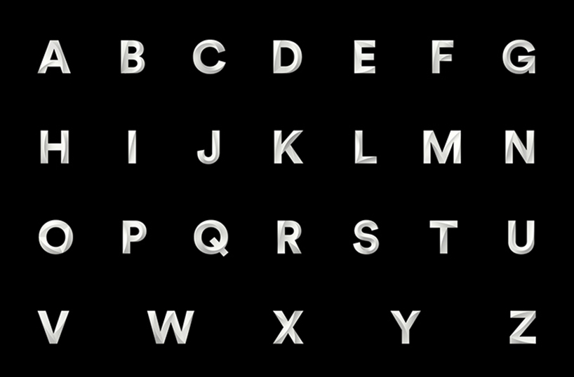
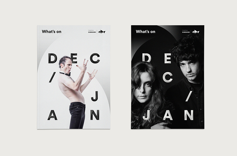
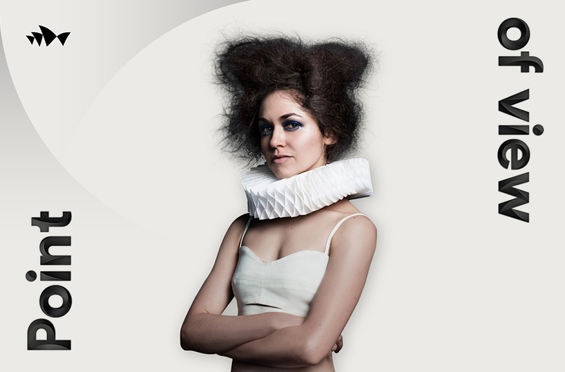

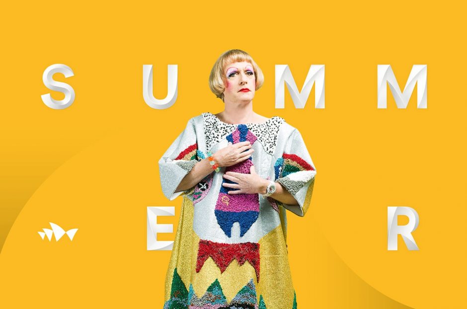
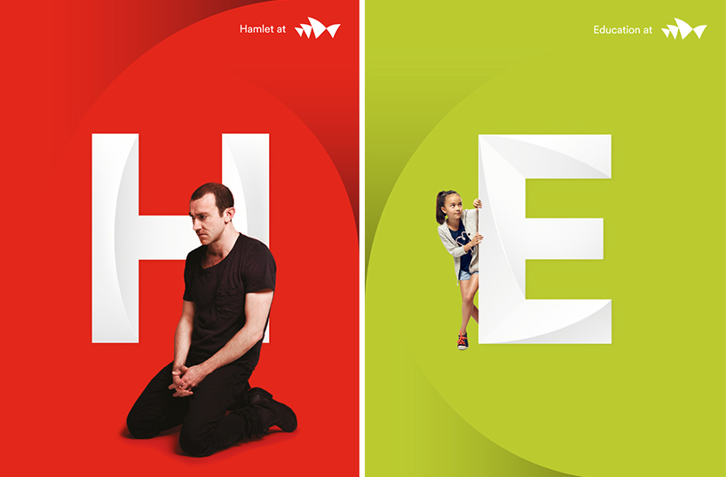
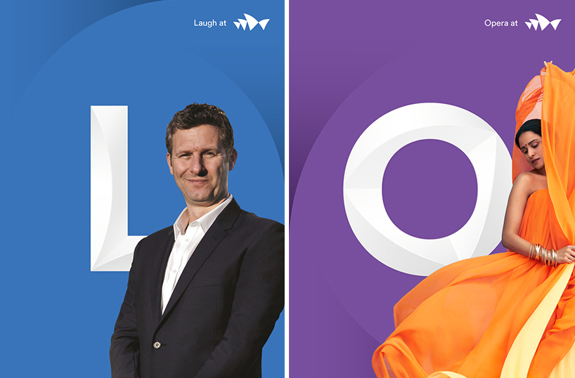
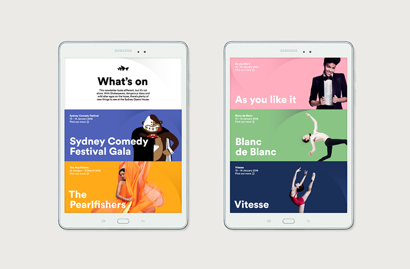
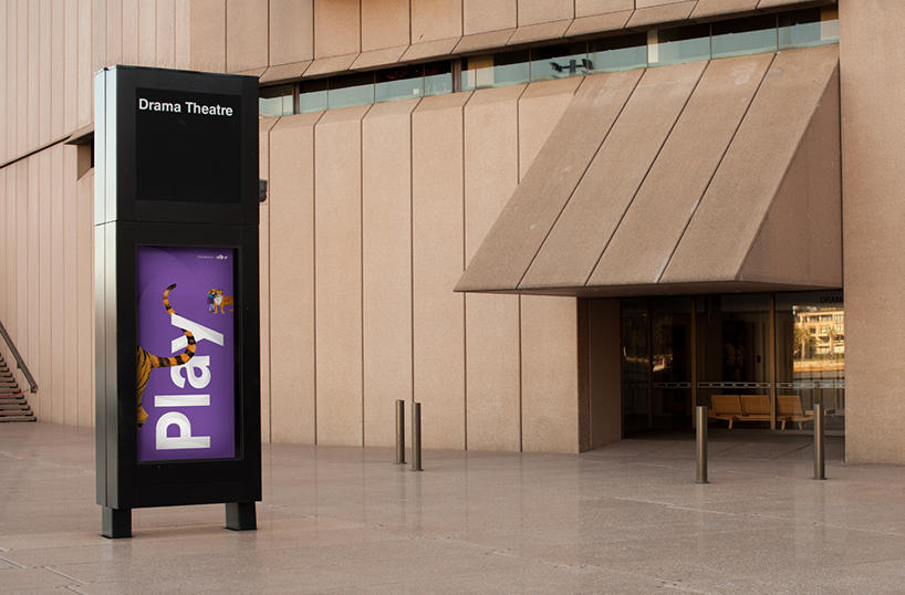
Interbrand set out with the aim to inspire conversation around culture and art while educating the target audience and helping them to understand that the landmark is about a lot more than opera (and selfies). Evolving the brand the agency took an idea of “Shifting Perspectives” and utilised this to translate through a sculptural language, which can be seen across a range of marketing materials and online content. The building’s iconic sails have been used to draw attention and interact with photography, while a three-dimensional typeface (which they called Utzon and was designed with Studio Laurenz Brunner) has been carefully crafted to reflect the contours of the building itself. Working to complement each other both elements breath a new, contemporary and elegant feel into the identity itself while working with monochromatic styling inspired by the building’s exteriors. Even though the core brand uses colours from the building’s exterior, comms linked to performances take on the mood of the content itself in the form of vivid palettes and vibrant colours. Interbrand have also created a tonal voice to communicate a new perspective and explain that although things look great from the outside, the real magic is what happens inside.
A wonderful example of branding at its best. Tell us what you think of the new look on hello@toworkorplay.com or give us a Tweet. For more information and videos of the rebrand check out Interbrands site here.
————
Want the latest posts, offers and exclusive tickets straight to your inbox? Subscribe to our newsletter and never miss out again.
Images © Interbrand срочный займ оставить заявку на займсрочно нужен займ на картусмс займ на карту с плохой кредитной историей
займ на карту мгновенно без отказа zaymi-bistro.ru займ на кредитную карту мгновенно
payday loans are short-term loans for small amounts of money https://zp-pdl.com payday loans online
Natalie is half Persian with a Geordie accent. Although small in stature, she makes up for it with a big personality! As a Graphic Designer you will often find Natalie gushing about her passion for all things creative and sharing her ideas with everyone and anyone who will listen. If she’s not decorating her house you will find her cooking up recipes from her foodie family or propped up in a cocktail bar in town.